CarMax — Vehicle Preview Enhancements
Improving wholesale vehicle review workflows so dealers could inspect inventory faster, navigate images more efficiently, and make more confident purchase decisions.
Role Senior Product Designer
Team 1 PM, 3 Engineers
Timeline 6 months
Focus Workflow optimization, interaction design, usability research, UI refinement
Outcome +16% engagement, +25% profit margin per auctioned vehicle
Overview
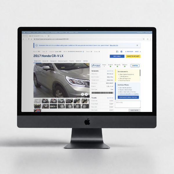
CarMax Auctions is CarMax’s wholesale auction business, where licensed dealers browse and evaluate vehicle inventory before bidding. Vehicle preview pages play a critical role in that decision-making process, especially for dealers assessing exterior condition and damage from photo sets.
This project focused on improving the vehicle preview experience by reducing friction in how dealers navigated, enlarged, and inspected vehicle images. The goal was to make the experience faster, more intuitive, and more supportive of confident purchasing decisions.
Why this mattered
For dealers using the platform, vehicle previewing is not a passive activity. It is a repeated, high-frequency workflow tied directly to confidence, efficiency, and buying behavior. Small interaction issues inside that experience compound quickly when users are reviewing multiple vehicles in a single session.
Improving the preview flow had the potential to strengthen both user experience and business performance by helping dealers inspect inventory more effectively and move through listings with less friction.
My role
I led UX across discovery, research synthesis, and solution direction for the vehicle preview experience. I partnered closely with product and engineering to identify the highest-friction parts of the flow, validate opportunities, and design improvements that balanced usability gains with implementation constraints.
I was responsible for:
framing the problem space
conducting and synthesizing research
identifying key usability issues
shaping solution direction
refining the UI and interaction model with engineering
The problem
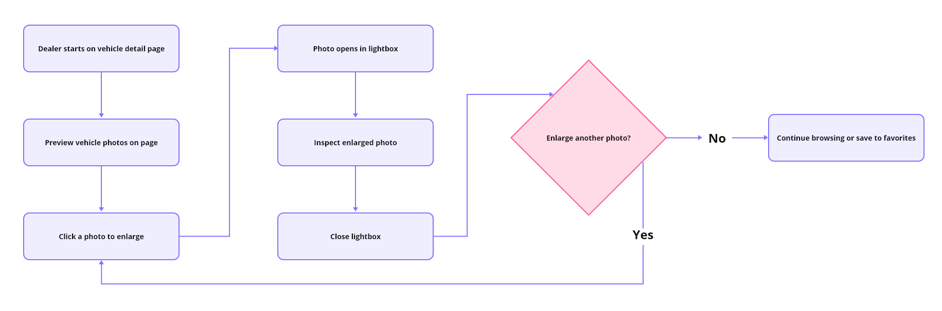
Dealers relied heavily on vehicle images to evaluate inventory quality, especially when reviewing exterior damage. But the image browsing experience introduced friction at critical moments in the workflow.
Users often had to:
repeatedly click through image galleries
open enlarged views to inspect damage
close those views and resume browsing
repeat that cycle multiple times per vehicle
That behavior slowed evaluation and added unnecessary effort to a task users performed over and over again.
Constraints
This work had to fit within several practical constraints:
delivery needed to happen within a roughly 6-month window
existing technical infrastructure limited how much of the gallery experience could be rebuilt
changes needed to improve usability without disrupting familiar dealer behavior too aggressively
solution scope had to focus on the most valuable friction points instead of attempting a full redesign
Research and insights
To understand where the experience was breaking down, I conducted usability testing, interviewed dealers, and reviewed user behavior patterns in the preview flow.
The research surfaced a few clear signals:
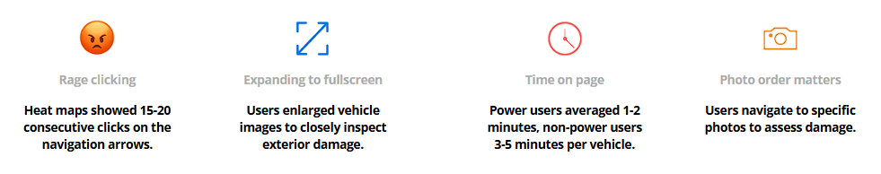
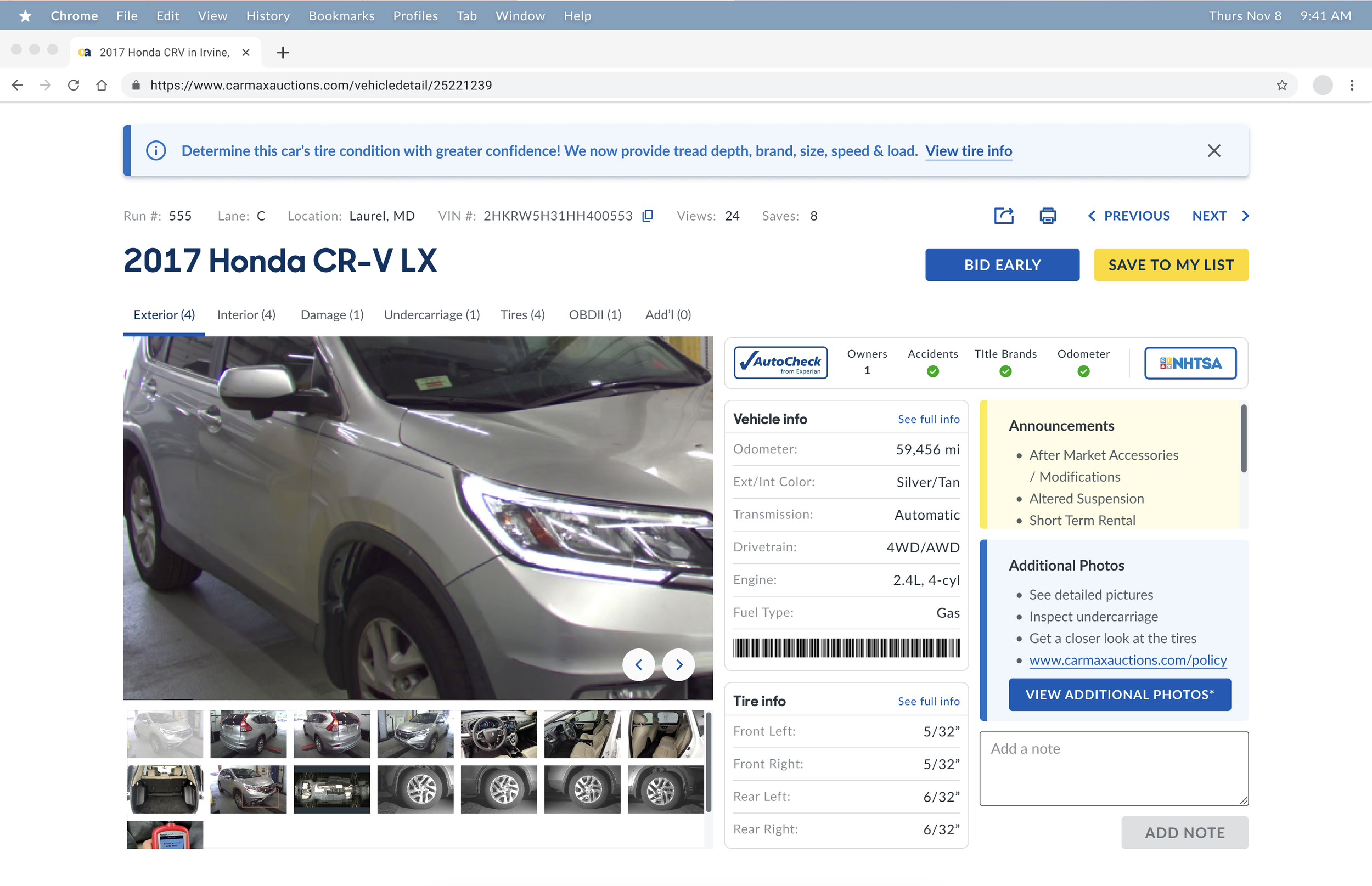
users clicked rapidly through image galleries, in some cases 15 to 20 consecutive clicks, suggesting friction in navigation
dealers frequently enlarged photos to inspect exterior damage, then had to close that view and continue browsing, which created a repetitive and interruption-heavy flow
time on page per vehicle increased from roughly 3 minutes to 5 minutes for users previewing cars, indicating more effort spent reviewing each vehicle
both power users and non-power users showed increased time in preview, suggesting this was not isolated to one user segment
These patterns indicated that more time spent was not necessarily a sign of a better experience. In this case, it often reflected a workflow that required too much effort to complete basic inspection tasks.
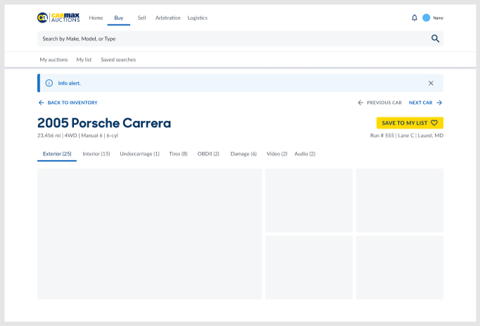
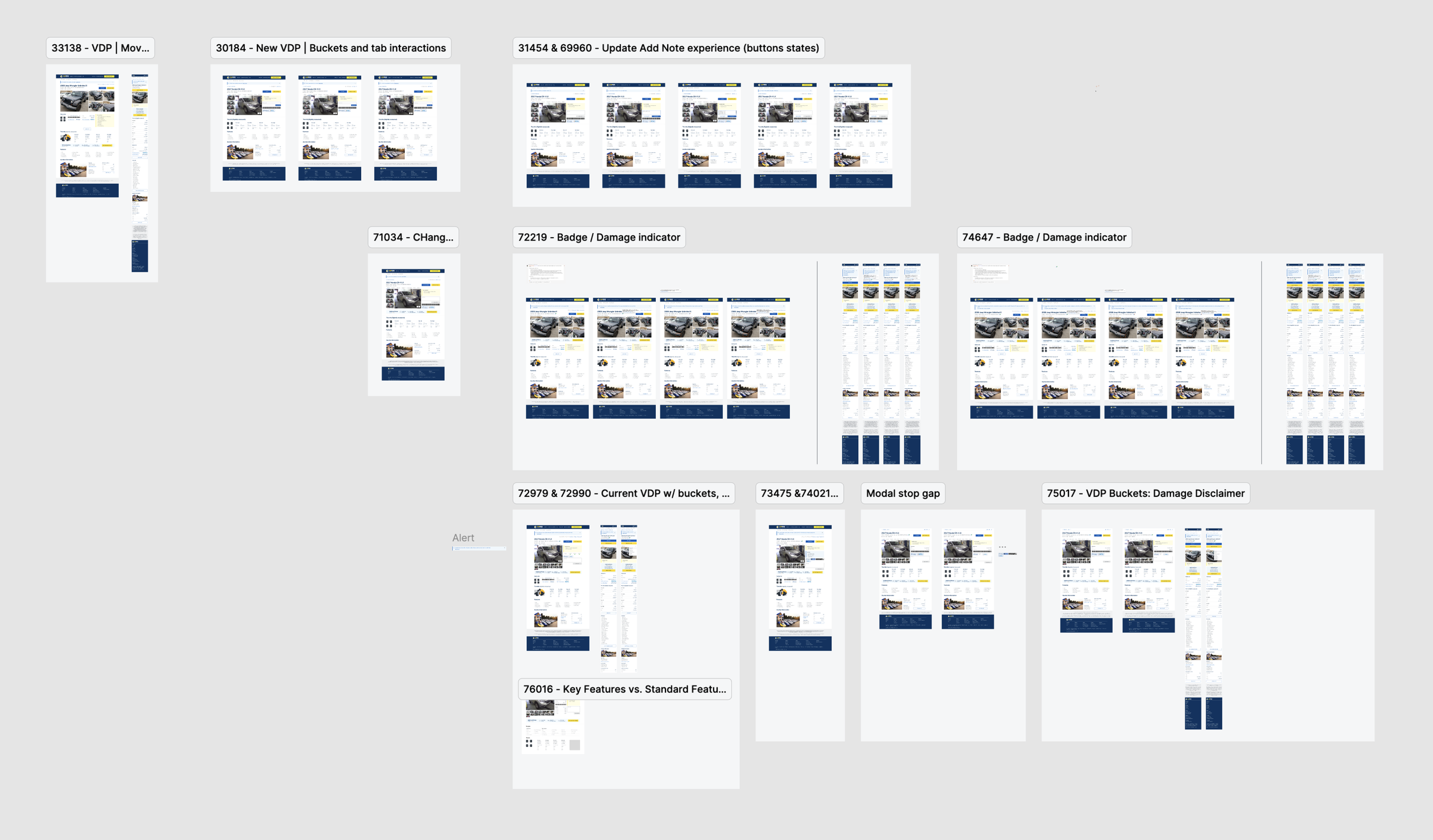
OLD FLOW
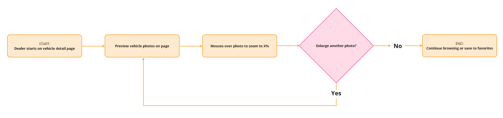
NEW FLOW
Key opportunities
Based on the research, I prioritized two opportunity areas.
1. Reduce image navigation friction
Users needed a smoother way to move through photos and inspect details without constantly breaking their flow.
2. Improve damage review efficiency
Because damage assessment was central to inventory evaluation, the preview experience needed to better support quick visual inspection and easier access to relevant images.
Design direction
I focused on improvements that could meaningfully reduce friction without requiring a complete rebuild of the preview system.
The design direction centered on:
making image inspection more fluid
reducing repetitive click patterns
improving continuity while browsing image sets
supporting faster review of damage-related photos
keeping the experience familiar enough to avoid unnecessary relearning
This was an important tradeoff. A more ambitious redesign could have restructured the full gallery model, but given the platform constraints and timeline, I prioritized changes that would create the most value in the most frequently used moments.
Final solution
The final experience improved how dealers navigated, enlarged, and reviewed vehicle photos. Instead of forcing repeated open-close cycles and interruption-heavy behavior, the updated flow supported a smoother path through visual inspection.
The solution aimed to:
reduce interaction overhead during image review
help users inspect damage more efficiently
improve momentum when moving through a vehicle’s photo set
create a more usable and lower-friction preview experience overall
In addition to improving the photo experience, the final design also supported clearer continuity in the browsing flow so users could stay focused on evaluating the vehicle rather than managing the interface.
Outcomes
The updated experience contributed to measurable business and product impact:
+16% engagement in dealer tooling
+25% improvement in profit margins per auctioned vehicle
improved support for both power users and non-power users during vehicle inspection
stronger usability in a workflow directly tied to dealer confidence and purchase decision-making
Reflection
This project reinforced how small interaction improvements can create outsized impact when they affect a high-frequency, business-critical workflow. When users are evaluating inventory at scale, every unnecessary click becomes expensive.
It also highlighted the value of pairing behavioral signals with qualitative research. The strongest opportunities did not come from aesthetics alone. They came from understanding where user effort was accumulating, then designing targeted changes that made the workflow meaningfully easier.