Google — Cases Admin Draft Annotations
Designing a scalable annotation pattern for internal review workflows so teams could better understand draft changes, reduce ambiguity, and review updates with more confidence.
Role
UX Visual Designer
Team
1 PM, 2 Engineers
Timeline
6 months
Focus
Internal tools, workflow clarity, systems thinking, reusable patterns
Outcome
Improved review clarity
Reduced ambiguity in draft states
Increased traceability across the workflow
Overview
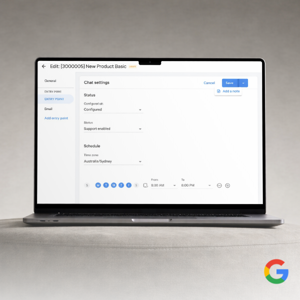
Cases Admin is an internal Google tool used to manage support knowledge and operational configuration. Updates inside the system often move through a draft, review, and deploy workflow, which means teams need clear visibility into what changed before publishing updates.
This project focused on improving how draft changes were communicated within the workflow by introducing a reusable annotation pattern that made edits easier to identify, understand, and review.
Why this mattered
When internal tools lack clarity, even small workflow inefficiencies can compound across teams. In this case, reviewers needed stronger visibility into draft changes so they could validate updates more efficiently, preserve context, and move through deployment with greater confidence.
This was not just about making information visible. It was about reducing ambiguity in a detail-sensitive workflow where context, traceability, and accuracy all mattered.
My role
I designed the annotation system and supporting interaction patterns that made draft changes easier to distinguish, interpret, and review. I defined how annotations would appear across states, shaped the visual hierarchy, and partnered closely with engineering to ensure the pattern could scale within the product.
I was responsible for:
defining the annotation pattern
designing how draft states would be visually represented
supporting consistency across workflow surfaces
partnering with engineering on implementation detail and design QA
The problem
Before this work, teams reviewing draft changes did not have enough usable context around what had changed and why. Reviewers needed to scan and validate updates quickly, but the existing workflow made that harder than it should have been.
The pain points were less about missing data and more about missing clarity. Users needed a better way to understand:
what content had changed
which content was still in draft
what supporting rationale or metadata existed
how that context should carry into later stages of review
Without that, even simple reviews introduced unnecessary cognitive load.
Constraints
This work needed to fit within an existing internal system and account for several constraints:
the solution had to work inside the current product structure
the pattern needed to scale across multiple change types and surfaces
visibility had to improve without overwhelming the interface with noise
the system needed to support present use cases while remaining maintainable over time
Key insights
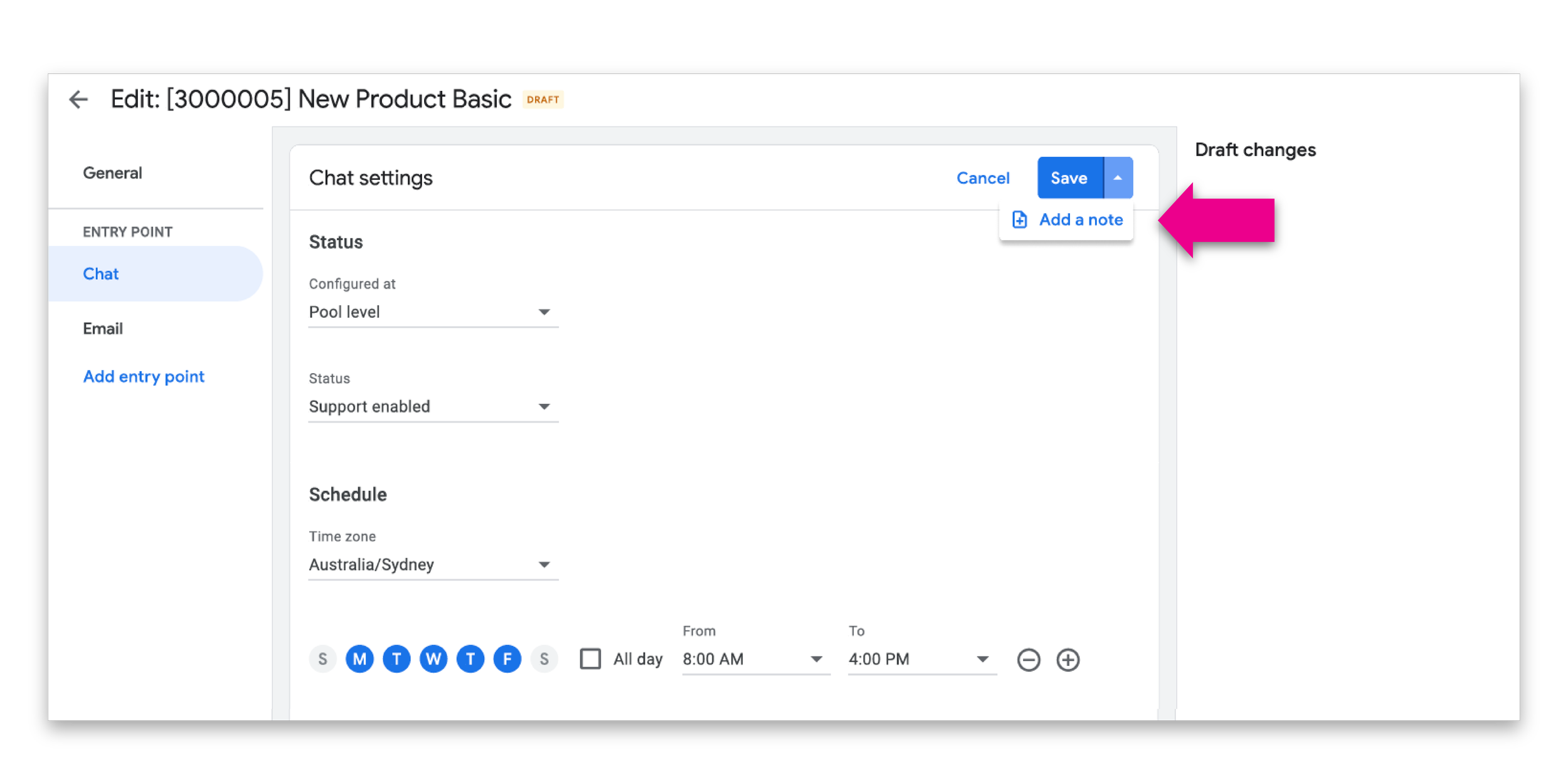
The central insight was that reviewers did not need more information. They needed more usable context.
That pointed toward a system-level solution rather than a one-off screen treatment. The right pattern had to help users quickly understand changes at a glance while still supporting detail where needed.
This led to three priorities:
make draft changes easier to scan
preserve rationale and supporting context
create a reusable pattern that could scale across the workflow
Design goals
To guide the work, I focused on four design goals:
1. Improve scanability
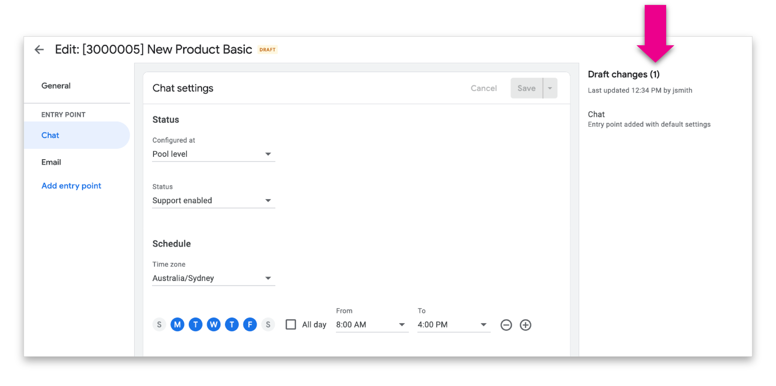
Draft changes needed stronger visual distinction so reviewers could identify them quickly without slowing down.
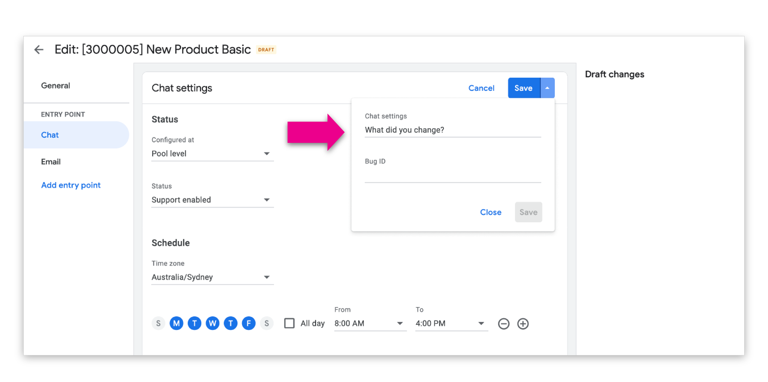
2. Preserve context
Annotations needed to support rationale, metadata, or ownership cues where relevant, so teams could better understand why a change existed.
3. Balance emphasis and restraint
The UI needed to surface change clearly without overwhelming the base interface or distracting from the task itself.
4. Create a reusable pattern
The system needed to work consistently across multiple parts of the workflow rather than solving only one screen.

Design direction
I focused on improvements that could meaningfully reduce friction without requiring a complete rebuild of the preview system.
The design direction centered on:
making image inspection more fluid
reducing repetitive click patterns
improving continuity while browsing image sets
supporting faster review of damage-related photos
keeping the experience familiar enough to avoid unnecessary relearning
This was an important tradeoff. A more ambitious redesign could have restructured the full gallery model, but given the platform constraints and timeline, I prioritized changes that would create the most value in the most frequently used moments.
Outcomes
The work improved the workflow in several meaningful ways:
reduced ambiguity in draft review states
improved confidence when reviewing and validating changes
increased traceability across draft, review, and deployment stages
created a reusable system that improved consistency over time
made collaboration smoother in a detail-sensitive operational workflow
Reflection
This project was a strong example of how internal tools benefit from careful systems thinking. The challenge was not only to make one interface clearer. It was to design a pattern that could support trust, scale across workflows, and reduce operational friction over time.
It also reinforced the value of visual design in enterprise products. Strong visual hierarchy is not decoration. In the right context, it is a tool for clarity, confidence, and better decision-making.