Surveys On The Go - Onboarding Optimization
Redesigning onboarding to reduce first-run friction, clarify value earlier, and improve account creation performance in a mobile consumer product.
Role Product Designer
Team 1 PM, 2 Engineers
Timeline 6 months
Focus Growth, onboarding, mobile UX, conversion optimization
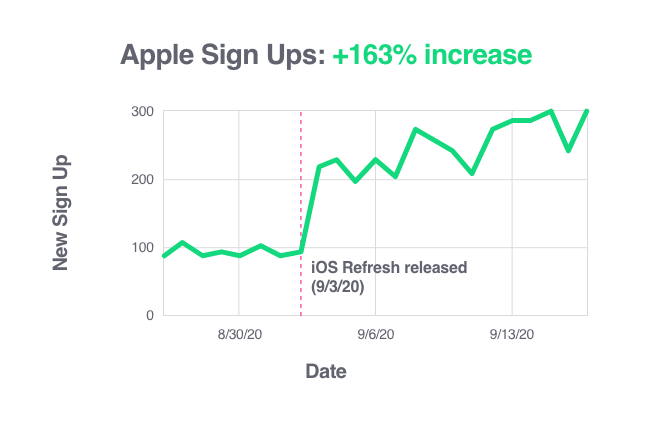
Outcome +163% iOS signups in the first week after launch
Overview
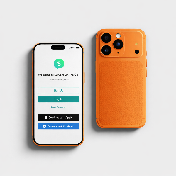
Surveys On The Go is a mobile product where onboarding plays a critical role in activation. The first-time user experience needed to help users understand value quickly, move through setup with confidence, and reach account creation with less friction.
This project focused on redesigning onboarding to improve clarity, reduce unnecessary effort, and support stronger signup performance.
Why this mattered
Onboarding is one of the highest-leverage parts of a product experience. Improvements at this stage affect activation, conversion, and long-term retention.
For Surveys On The Go, the opportunity was straightforward: if users could understand the product faster and move through setup with less hesitation, the business could convert more early interest into completed signups and ongoing engagement.
My role
I led the redesign of the onboarding experience, focusing on how to simplify the flow, improve information hierarchy, and create a clearer first-run journey.
I was responsible for:
identifying friction points in the onboarding experience
shaping the revised structure and UX flow
improving the clarity and pacing of onboarding screens
refining the interface to better support trust, momentum, and conversion
The problem
The original onboarding experience introduced too much friction too early. Users needed to understand value, make decisions, and move through setup, but the flow did not support that progression as clearly or efficiently as it should have.
The main issues centered on:
too much cognitive load during first-run use
insufficient clarity around value early in the experience
onboarding structure that did not guide users confidently into account creation
friction that slowed user momentum at the point of activation
The result was a flow that created unnecessary resistance during one of the most important stages of the product experience.
Constraints
The redesign needed to work within a few important boundaries:
core business and signup requirements had to remain intact
clarity needed to improve without adding more steps
the experience had to support both speed and trust
the solution had to be practical enough to launch quickly
Key insights
The strongest insight from this work was that onboarding was asking users to do too much before they had enough confidence or momentum.
That pointed toward three clear opportunities:
clarify the value proposition earlier
simplify the path through setup
create a more polished and guided first impression
Rather than adding explanation, the better approach was to reduce hesitation through stronger sequencing, clearer hierarchy, and a smoother overall progression.
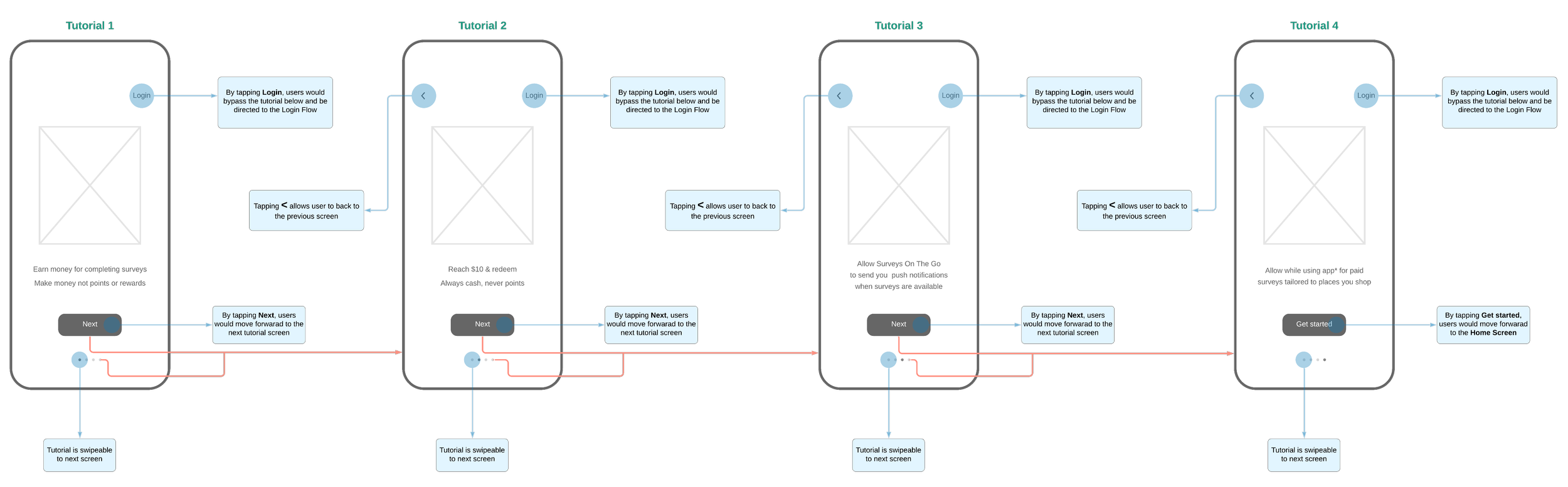
Design goals
1. Reduce first-run friction
The flow needed to feel lighter and more direct so users could move through setup with less hesitation.
2. Clarify value earlier
Users needed a clearer sense of what the product offered before investing effort in the process.
3. Improve momentum
The experience needed to guide users forward more confidently rather than forcing them to pause and interpret what to do next.
4. Strengthen the first impression
The onboarding flow needed to feel more polished, intentional, and trustworthy.
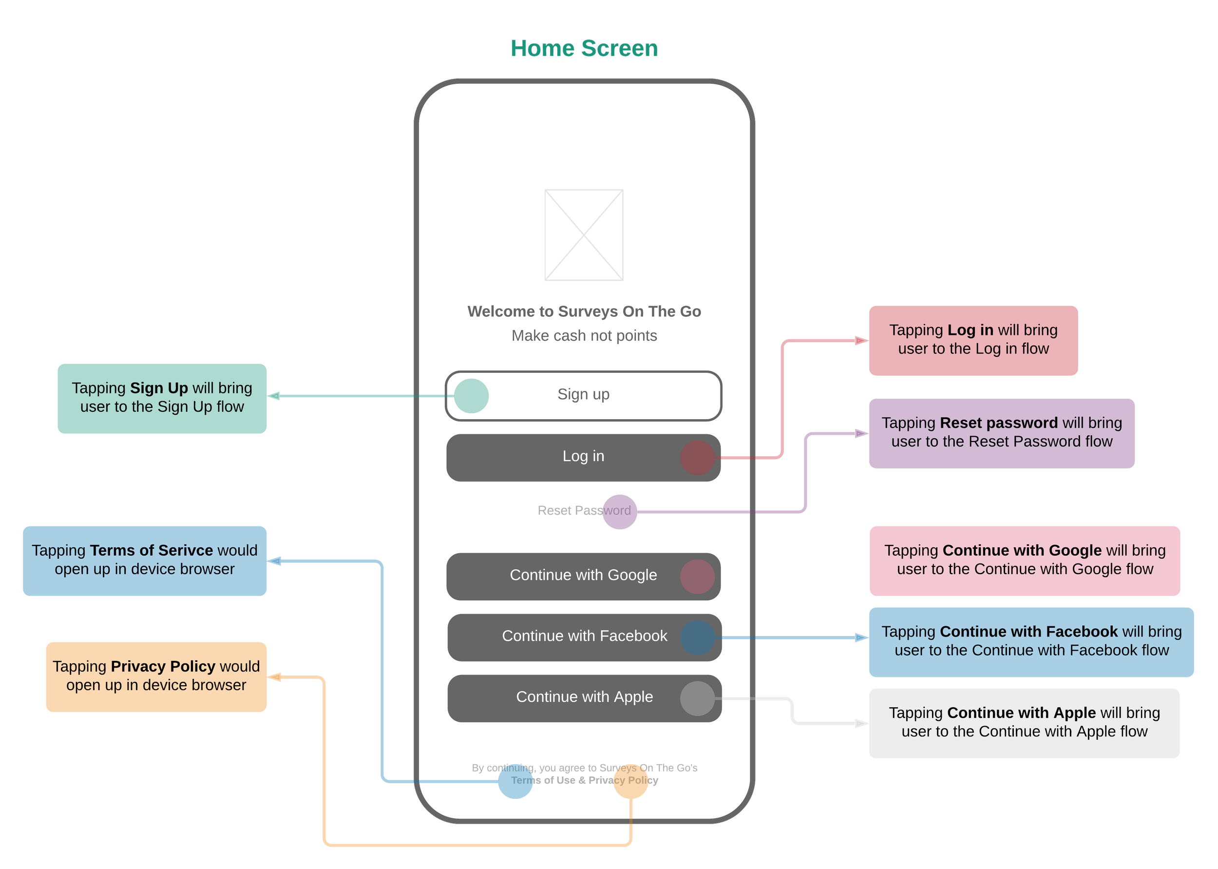
Design direction
I redesigned the onboarding flow to simplify the overall experience, improve pacing, and create a more conversion-friendly entry point.
The direction focused on:
reducing decision fatigue during setup
improving information hierarchy
sequencing content more intentionally
creating a more polished mobile-first interface
supporting clarity and speed without sacrificing trust
The key tradeoff was between reassurance and efficiency. Over-explaining the product could have added context, but it also risked slowing users down. I prioritized a clearer structure and faster progression while keeping enough information in place to support confidence.
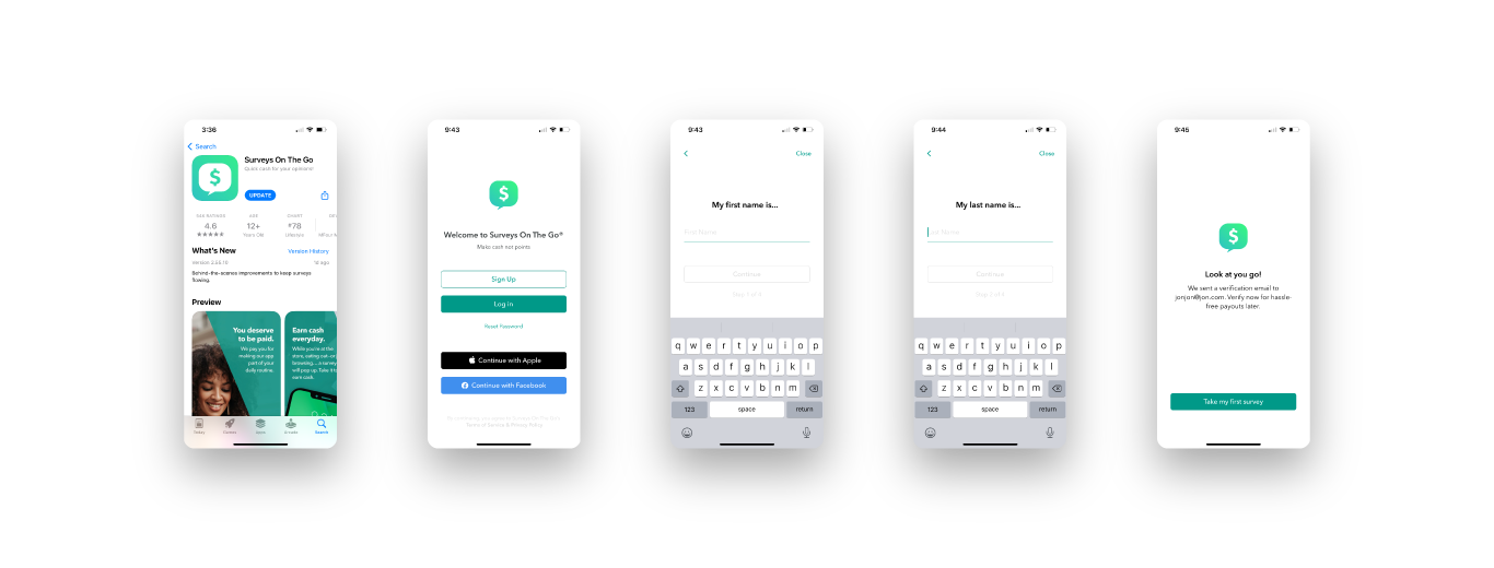
Final solution
The final onboarding experience delivered a more focused, guided journey with stronger hierarchy and better flow progression. The redesign helped users understand value earlier, move through setup more smoothly, and complete account creation with less friction.
The updated experience was designed to:
reduce cognitive load during onboarding
improve pacing across first-run steps
make the setup process feel more intuitive
create a stronger first impression aligned to activation goals
Outcomes
The redesign produced a measurable business result:
+163% iOS signups in the first week after launch
It also improved the onboarding experience by making the path to signup feel clearer, more efficient, and more supportive of user momentum.
Reflection
This project reinforced how much leverage exists inside early user journeys. Small improvements in pacing, hierarchy, and friction reduction can have an outsized impact when they occur at the point of activation.
It also underscored the importance of designing onboarding as a behavioral flow, not just a sequence of screens. What matters most is whether the experience helps users move forward with clarity and confidence.