Google Cases Admin Annotations
ROLE
UX Visual Designer
TEAM
1 PM
2 Engineers
TIMELINE
6-months
SKILLS
User Interviews
Wireframing
Prototyping
User Testing
TOOLS
MY CONTRIBUTION
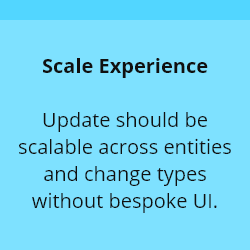
Created the annotation UI pattern and component specs across Draft, Review & Deploy, and History
Defined density/hierarchy rules to keep high-volume change lists scannable
Designed clear labeling for bulk/copy/cascade changes to reduce review errors
Partnered with Eng on implementation and ran design QA to ensure consistency and accessibility
Figma
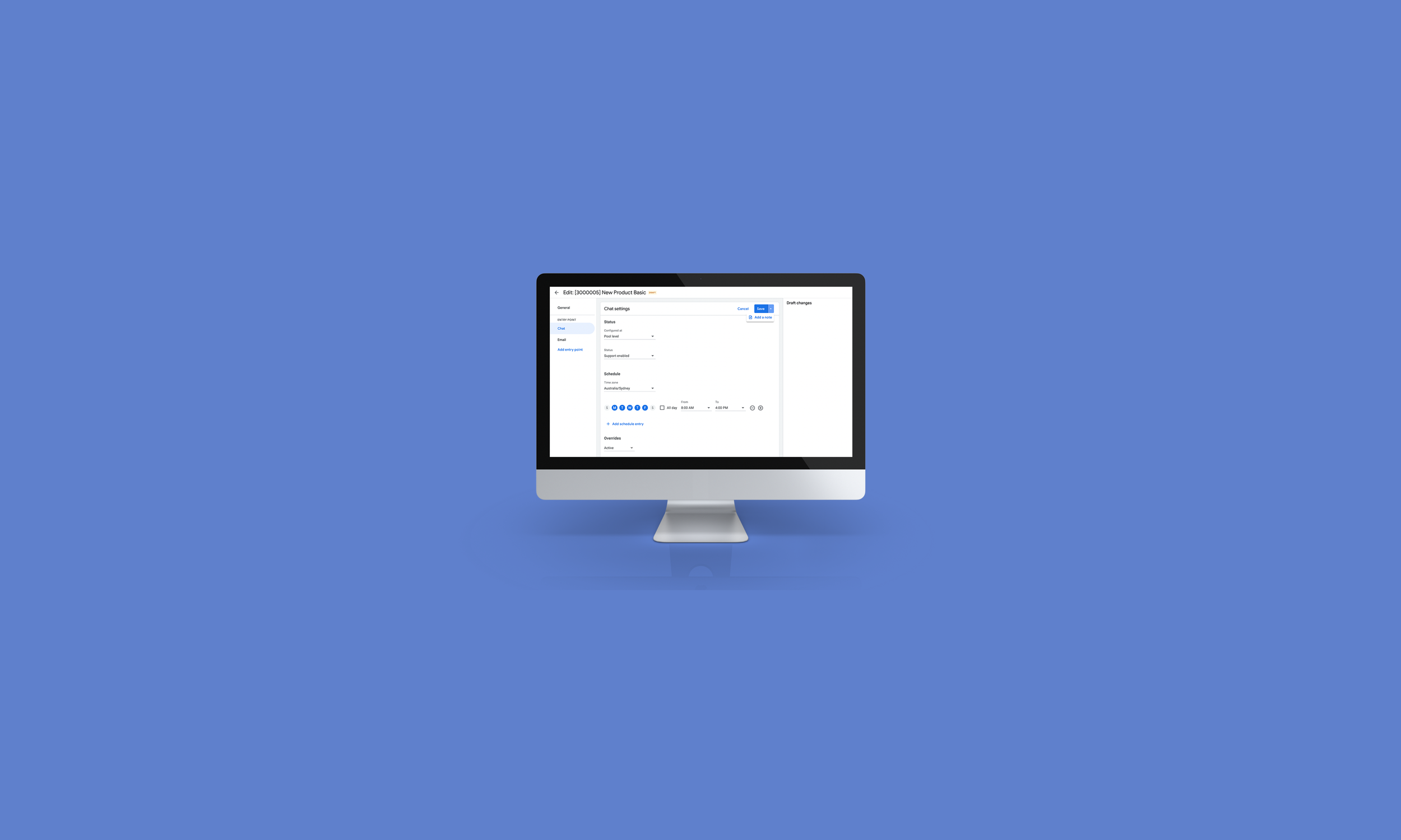
Cases Admin is an internal admin tool where “setting configurators” manage support strategies and operational configurations (pools, inbound aliases, dimensions). These changes often sit in draft, get reviewed, then deployed—so teams need clarity on what changed and why before pushing to production.
CONTEXT
What is Cases Admin?
Admins configuring Cases Admin settings couldn’t annotate draft changes. Collaboration and rationale lived outside the tool (often in Buganizer), which slowed reviews and increased deployment risk.
Problem
Design a consistent annotation UI pattern for draft and deployed changes (rationale + optional bug IDs), surfaced in Review & Deploy and Change History, plus visual clarity for bulk/copy/cascade changes and optional ownership/notification support.
Solution
DESIGN GOALS
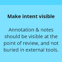

Admins needed context while scanning a list of changes. I designed annotation affordances to live where decisions happen, so reviewers can understand rationale without leaving the workflow.
IDEATION
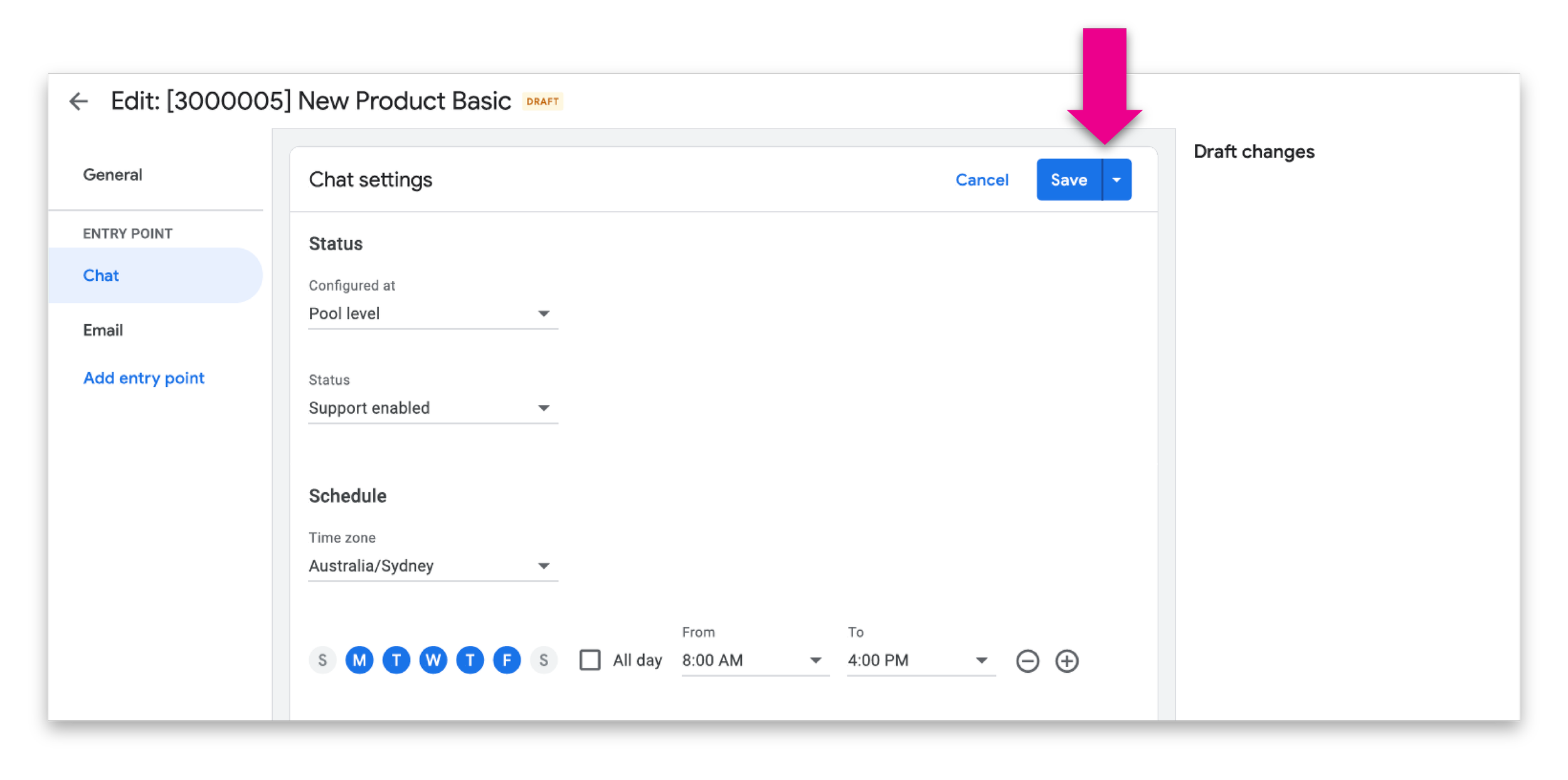
A clear “Annotate” affordance per change row
Lightweight edit state that doesn’t overwhelm the list
High scannability: rationale + optional bug IDs readable at-a-glance
What this looked like in UI
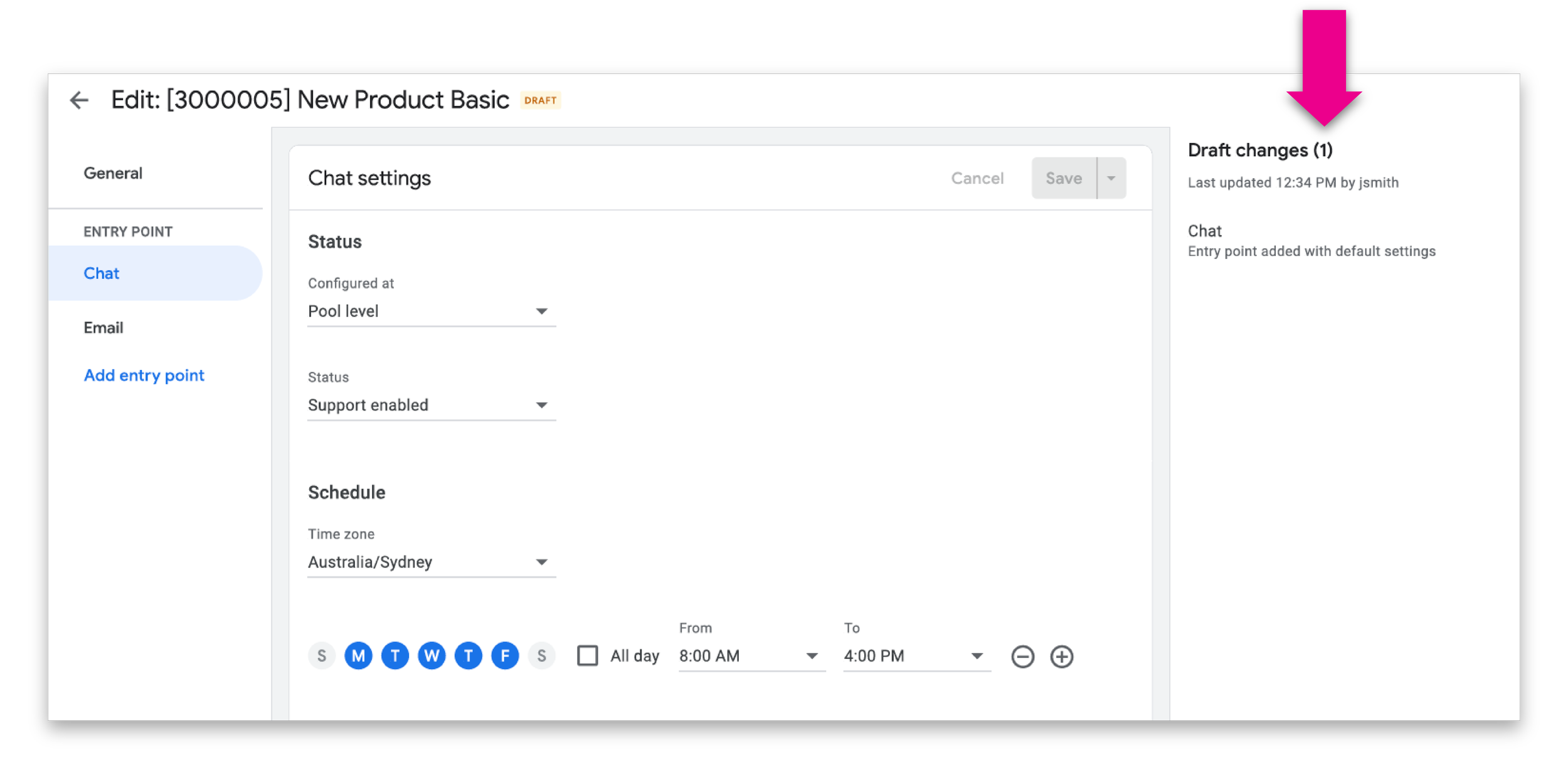
To avoid duplicate work, draft annotations carry forward into the deployment step (editable at deploy time). This keeps rationale intact across states and improves handoff clarity.
UI impact
Less retyping
Less context loss
Stronger review confidence
Defining the logic
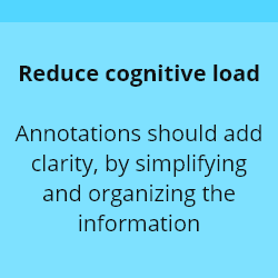
Admin change lists can be long. I treated this as an information design problem.
Visual hierarchy to distinguish change, annotation, and metadata
Clear spacing and typography rules to avoid “annotation soup”
Guardrails on how much detail is visible by default (and when it expands)
Design clarity
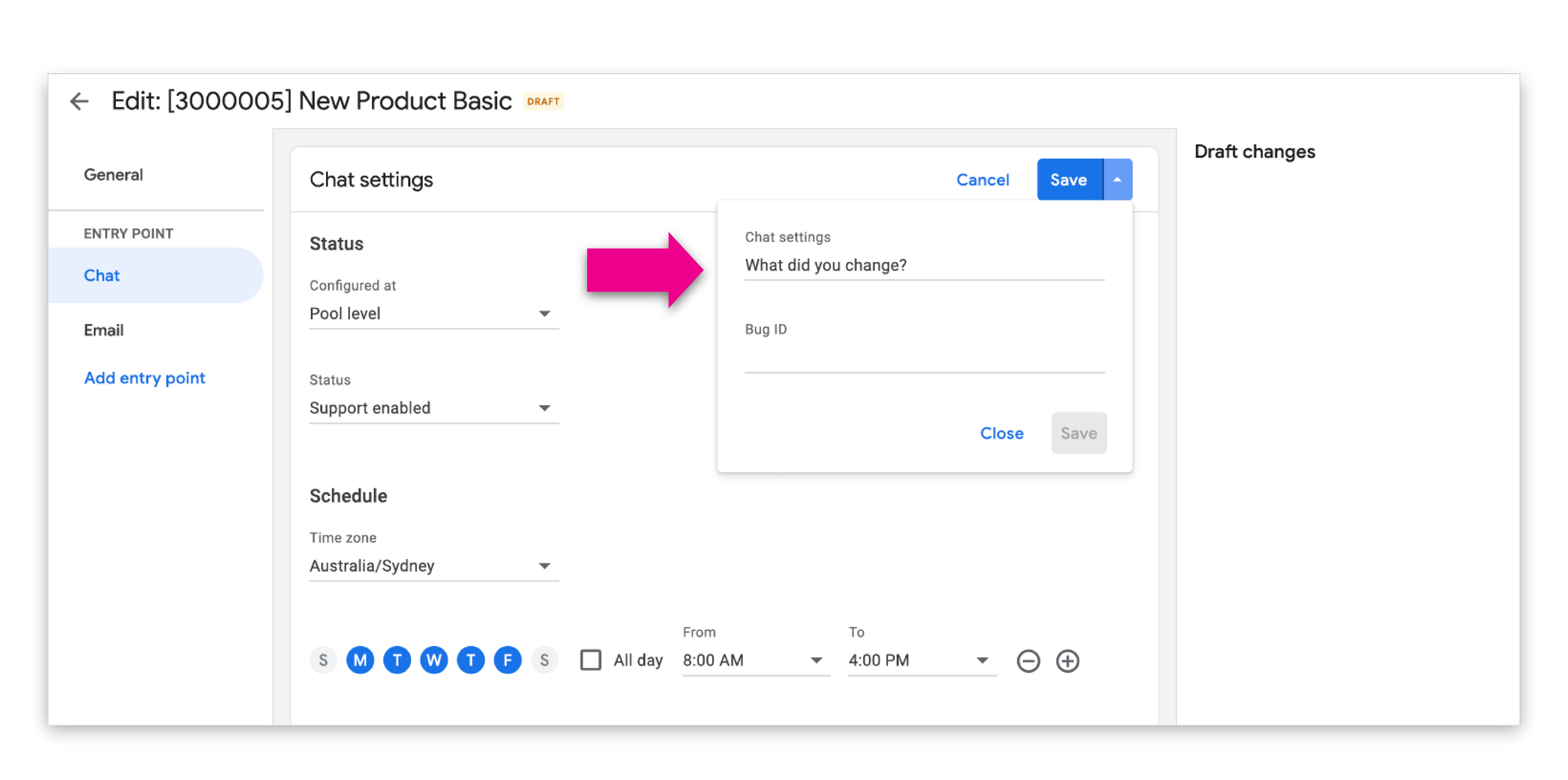
Admins can add:
Rationale/description
Optional bug ID(s) to draft changes, with the same model available for deployed changes. Displayed in Review & Deploy and Change History.
Defined the visual pattern, interaction states, and how the fields appear across surfaces
Wrote handoff specs for states and behaviors (view/edit/empty/error)
Ensured ownership UI doesn’t compete with annotations visually
Designed clear, compact placement for owner metadata and notification cues
DESIGN & EXPERIENCE
OUTCOME
Reduced reliance on external bug threads for basic “why” context
Faster Review & Deploy cycles (less back-and-forth clarification)
Higher reviewer confidence (qual feedback from configurators)
Increased traceability via bug IDs and visible rationale in history