Surveys On The Go Onboarding Optimization
ROLE
Sr Product Designer
TEAM
1 PM
3 Engineers
TIMELINE
6-months
SKILLS
Discovery
User Interviews
Surveys
Wireframing
Prototyping
Design System
Branding
User Testing
TOOLS
Jira
Confluence
Lucid Chart
Sketch
Figma
Adobe Illustrator
Adobe After Effects
Surveys On The Go is as mobile app that pays users for completing consumer research surveys. It has a strong user acquisition pipeline, with thousands of installs per week across iOS and Android. However, activation and long-term engagement remained below benchmark.
My objective was to uncover the core friction points in the user experience and redesign key flows to increase first-week activation, survey completion, and repeat app visits.
CONTEXT
What is Surveys On The Go (SOTG)?
While SOTG attracts new users through ads and app store visibility, many users abandon the app before completing a single survey. Key metrics showed:
42% of new users completed their first survey in the first 7 days
18% day 30 retention (D30)
Negative reviews cited “confusion, “no surveys available,” and “not worth it”
Hypothesis: Users were unclear about how to earn rewards, when surveys appear, and whether the app was trustworthy or legitimate.
THE PROBLEM
Connect with users to understand expectations, pain points and behaviors to drive design.
DISCOVERY
User quotes
“I didn’t know what to do after signing up.”
“I expected a list of available surveys but saw nothing.”
“I don’t trust apps that don’t show value immediately.”
Behavioral Patterns
Users dropped off after viewing an empty or cluttered home feed
Reward mechanics were unclear (e.g., when and how you cash out)
KEY FINDINGS
Based on the insights, I generated and prioritized the following potential solutions:
IDEATION
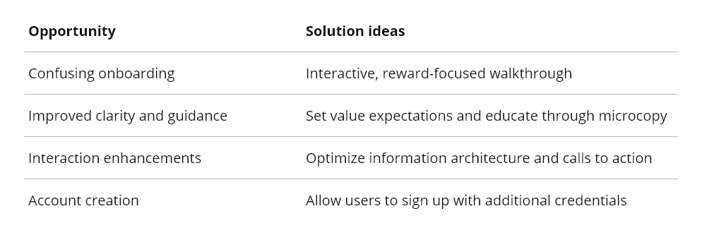
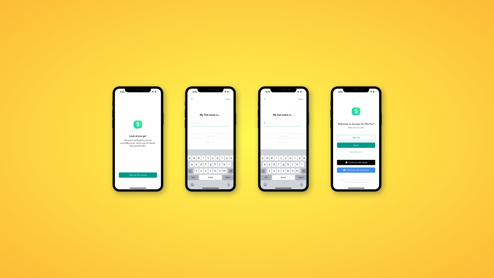
Account creation
Your home/login screen is basically the first impression of your app, it’s where users decide in a few seconds whether they trust it, understand it, and feel like it’s worth their time.
If that moment feels confusing or tedious, they bounce. A solid onboarding flow starts with fast, low-friction sign-in (Apple/Google/SSO, easy password reset), a clear one-liner on what the app does for them, and one obvious next step. Then you guide people with short, skippable steps, clear microcopy, visible progress, and a quick first “win” so they feel the value before you ask for more.
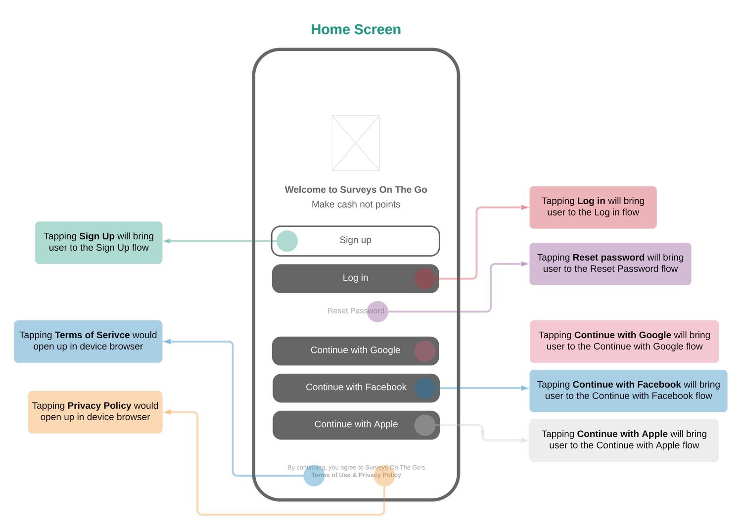
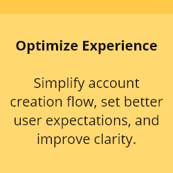
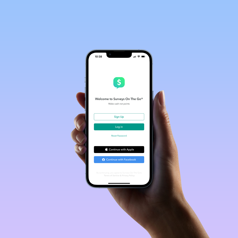
The goal of the design update was to reduce friction, set better expectations, and communicate the apps leading differentiator of “Making cash, not points” for surveys.
I believed giving users the ability to login via SSO and/or social media could reduce the time of account registration, while validating authentic users.
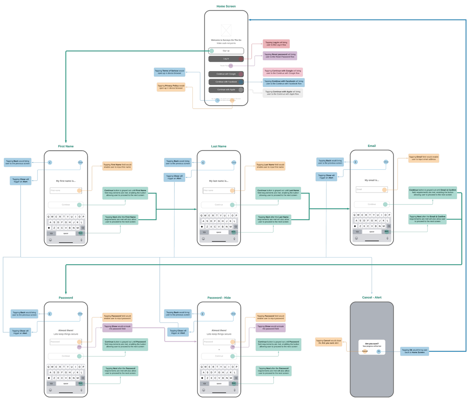
Updating the user flow was essential to get users to participate in surveys faster. Users download the app to take surveys for cash rewards; reducing the number steps it would take for a user to take their first survey was a primary goal.
I reduced 10 registration questions down to the following:
First name
Last name
Email
Password
Users then had the ability to setup payment accounts in-app.
Branding and Design played an important role alongside the Experience design. I had the opportunity to establish a new design system for Surveys On The Go, which included a new logo, color palette, typography, and visual use of illustrations and photography.
DESIGN
The goal of the branding update was to level-up visibility, build/establish trust, and reduce cognitive brand load for current and future users. Before the rebrand, Surveys On The Go had multiple names associated with the app via App Store, Google Play, and legal documentation.
Names associated with the brand
Surveys On The Go
Surveys (home screen)
SOTG (Terms of Service)
ON GO (app icon)
Rebranding Surveys On The Go was crucial to energize the brand, improve recognition, and establish trust through consistency. The inspiration of the rebrand communicates how users can “earn or make money” by sharing their feedback.
Initial concepts
Finalized concepts
I worked with Marketing, conducted user interviews, and surveys to get a pulse on how the brand was being interpreted and experienced buy users and internal stakeholders.
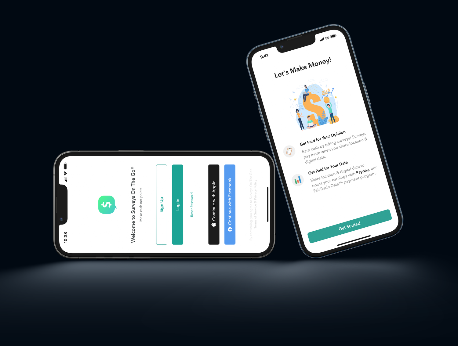
Home / Login screen
Updated illustrations and use of iconography
REFLECTION & LEARNINGS
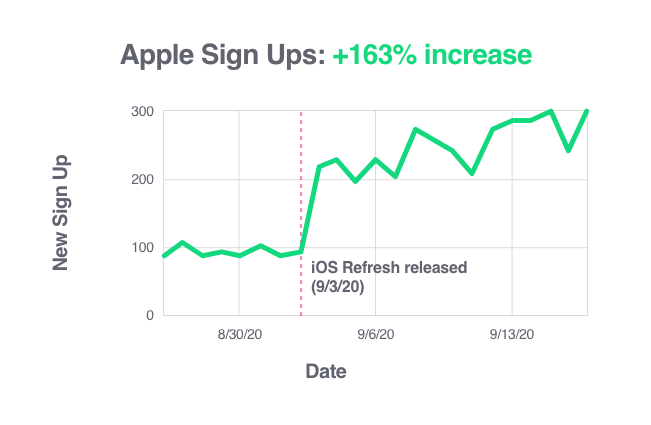
The app refresh (iOS) was implemented on 09.03.2020. The implemented refresh consisted of the following; updated brand identity, sign-up flow, login flow, reset password flow and Apple & Facebook authorizations. Within the first week iOS sign-ups increased by +163%. The app jumped into the top 100 ranked lifestyle apps in the App Store after the first 30 days of implementation (previously ranked 167th).
What worked well
+25% more completed account setup
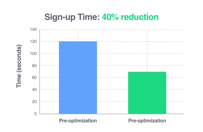
40% faster onboarding process
15% increase in first week retention
What could be improved
Personalization in Onboarding – Customizing the experience based on user intent
(e.g., first-time vs. returning users) could improve engagement.Deeper Behavior Analytics – Implementing session recording and event tracking for ongoing optimization.